Thursday, November 1, 2018
Feature Story Blog
Background Information/Process
Over the past couple of weeks we had to work on a feature story project where we had to interview someone. The whole process was pretty fun, since River was a great person to work with. we worked hard together to come up with good question and to make sure that the setting was good and the pictures and videos made sense. I learned a lot about how voiceovers work and how you need to put them into a video, I also figured out more audio and video editing skills. Going back to talking about River, she was a great person to work with and if she wasn't able to record on a certain day she always made up for lost time on days we could record.
My View on the Video
If I could go back I would definitely re-record our scenes in the art room. The biggest problem with it is that I was sitting on the left side of the camera so she ended up looking at the smaller side of the area rather than the larger. On there other hand, if I were to do a project like this again, I would keep doing the panning b-roll like I have in this video. I really like when it starts out on a small portion then you see it pan over to show much more.
General Thoughts
This video was definitely not easy, and one thing that I can draw from it is time management. Being able to manage your time properly will help you get your work done on time and will make sure that you have enough time to edit after you record. In general, I think this project was an amazing learning experience and has help me realize what it is like to be a high school reporter.

Wednesday, May 23, 2018
4th Quarter Review
We have been working on a project to create a product that doesn't have to be realistic, but we have to make the logo and the item to present it as if we were on shark tank. This project took us about a total of eight weeks since we had to get all the animations down and make sure our recording was correct, this process to much longer than it needed to but it was fun either way. Many of the challenges were time constraints, this was because we could only make our ad 30 seconds long and we had so much we wanted to put in there, but sadly it wasn't going to work. A big thing that I learned through out this project was that things won't always work like they are supposed to and that you will need to find away around that to meet your deadline, and that was a very tricky thing. One big portion of feedback that we received was about our website, we need to add some more things to it, but other then that we didn't hear much else. Since we got that we added a lot more to the FAQs and we made some jokes with the website to make it more relatable and funny. I think that everyone in my group did an amazing job on the project and since we all worked so hard I am really happy with the outcome.
 For most of class I had the opportunity to work on the animated ad and the animated web banner, mainly because I love to animate and I'm decent at it. When I finished my work I usually went over to my other teammates and helped them if they were struggling and we found ways to make everything better in the project. While I was outside of class I looked for certain ads on T.V. or I looked in magazines or whatever I could find to see how professional companies made their ads so that they could spread the word about their products. I have many strengths when it comes to computers themselves, but the parts of what you do on the computers is a bit different, I am only really good with animation and I'm not even able to do that very well. A really big part of my strength is my ability to focus in a really loud environment, which allowed me to work well in the classroom even when my classmates were being very loud. One of my biggest weaknesses is graphic design, I am not very good with logos and many other parts. The other weakness that I have is that I am not really able to still for long after working and so I check what else I can add to a picture and I end up adding to much detail. I could definitely improve with video as well so that I could make better scenes and put everything together properly. A big thing that want to be able to do is edit videos with a green screen better so that I can make the background show whatever I want it to show.


Wednesday, March 7, 2018
AI Snowflake


Tuesday, March 6, 2018
CARP Web Project

Contrast- We had to use contrast with the colors for each paragraph. We used colors from the dogs fur to make the title and paragraphs. I bolded the first line of the beginning paragraph so that it would stand out as the start. The contrast between black and white makes sure that you are able to the the important parts.
Alignment- This was used for the paragraphs when I aligned them to the left side of the page. The heading was center aligned to make it stand out from the paragraphs, and we put the second part of the header under the main header so that it will still look like part of the header but not making it look like the big part.
Repetition- I used repetition with the paragraphs, making them each the same color, and font. Another part was using the same color for the header to make it look different. The repetition stood out with the paragraphs where they are the same color as the black background so that it will be another repeated color so that it will stand out.
Proximity- The proximity really mattered with the paragraphs and the picture so that they would look separate but I would still be able to have the picture in the article. Having the paragraphs spaced how they are makes them stand out as separate parts but still shows people that they are one big thing. A large gap between the two headers lets them show as different things but the color of them lets them still show up as the header.
Wednesday, February 28, 2018
The Personality of Dakota Altic


My personality type is ENFP, this means that I am a supportive person and very sympathetic, as well as preferring to find another way to do something that may already have a definitive solution. I feel that this does described me, I don't think it's down to the exact detail but for the most part it is correct. Other people who have this personality type are stand-up comedians like Robin Williams and Jerry Seinfeld, I also have the same type as people who did some bad things in their life like Ulrike Meinhof who created the terrorist group Rote Armee Fraktion, which just means Red Army Faction. Knowing that this is my personality type could explain why I am so empathetic towards people and can help them with many problems. Many people in my friend group act the same as I do, but others are just completely opposite of me.
When I work in a group I usually play a role that could be defensive or offensive depending on the situation, which means I can back my team up (even though I'm not very good at sports). Being in a group setting allows me to express myself in a way that others wouldn't see in smaller setting, I'm able to help others that may be bothered by certain things and even if I haven't gone through the same thing I can still give them as much support as possible. I think that in my past I wouldn't have the same personality type, I was very rude and didn't like to hear other people's opinions, but now I'm able to listen well and make changes depending on the situation.
While doing this assignment I learned that I am a lot more of an extrovert than I thought I was. I liked being able to figure out my personality type and learn that there were many famous individuals like me.
Recently we took another less accurate personality test that would help us for groups, this test was called LOBG which stood for Lion, Otter, Beaver, and Golden retriever. For my results I got Otter, the otter traits said that these people are very open and positive but have a tendency to talk way too much. I feel like this can be true in some sense but this says that they usually rush their jobs and don't do it very well, but I always work my hardest to make sure that a job is finished exactly how it should be.
Logo Design


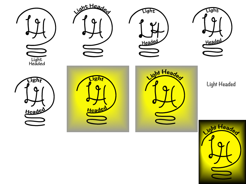
For over a week we have been working on a project where we create our own logo. At first we had to sketch our image, we were given 2 days to do so, and I made mine based on a video game studio idea. The next part was choosing which sketches we like the most and redrawing them on the computer. I only had one I liked the most and I based it from there, which I really liked since the simplistic design gave me a lot more creative freedom. A background was not required for our images but I decided to try one out since I couldn't really put color on a line. My next idea for the mockups was that when it came to shirts, I wanted to have the logo small on the corner of the front and very large on the back, the one on the front wouldn't have the company name on it but the one on the back would.
My whole thought process started with a complex looking light bulb, but then I realise (with help from Mr.Olson) that the complicated look would be hard to do on a computer and that it is too much. A simple design allowed me to bring out the best of the logo and make sure that it stood out from others, but still put more attention to the products we produced. The beginning didn't show the name how I wanted it too, so I put it around the top. I thought it may look better with a different LH, but that just made it look a lot worse so i tried a new typeface and the original LH and I got a logo that I really liked.
Monday, February 5, 2018
Wizard of Oz poster project

Contrast
Since we were doing a poster project, contrast played a huge role. We had to use it to make sure everything that needed to stand out does, and things that don't are still there but not as outstanding. I used contrast mainly on the name of the play by making it larger and a better color so that if people look over at it, they will see the name first. I wanted the date to be better as well, so I made it the same color as the title. We did have some extra parts which I but in the bottom corners for legal reason.
Alignment
Alignment was just as important as contrast, as it makes the lines easier to read. I wanted to to do a center alignment because I didn't want the poster to look very serious, since it is not a very serious play. Putting the different parts of the name around the picture makes it a little bit trickier to know what the next part to read was, but I made the parts look the exact same to solve that problem. The text in the corners are aligned to their appropriate sides (the two in the left corner are left aligned, and vise versa). We didn't have a tool like they have in word where it center aligns it for you, I have do do my best to make sure that the words are in the middle.
Repetition
Repeating the same thing makes it less confusing but still shows creativity. I used the same color for the title that I did for the date and time to make sure that those are the first texts that people see. The same font was used in the bottom part with the date, contacts, and cost. I wanted to use the color white as parts that are not very important but I still wanted to put them on the poster so people would understand everything about the play. The main part of the poster was the title, so to make it stand out from the date, but still have the same color, I added a shadow so that it pops.
Proximity
The placement of words and pictures in this poster was really important. I wanted to place the words in a part of the picture where they would stand out from the yellow brick road and so that people would see those words first. Figuring out where to space out the date and time from the price and contact was kind of weird since I didn't want them to be to far apart but I wanted people to recognize them as different, so I gave them a small amount of space and put the contacts close to each other.
Subscribe to:
Posts (Atom)