


For over a week we have been working on a project where we create our own logo. At first we had to sketch our image, we were given 2 days to do so, and I made mine based on a video game studio idea. The next part was choosing which sketches we like the most and redrawing them on the computer. I only had one I liked the most and I based it from there, which I really liked since the simplistic design gave me a lot more creative freedom. A background was not required for our images but I decided to try one out since I couldn't really put color on a line. My next idea for the mockups was that when it came to shirts, I wanted to have the logo small on the corner of the front and very large on the back, the one on the front wouldn't have the company name on it but the one on the back would.
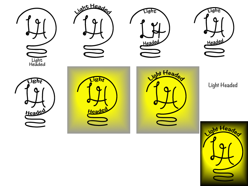
My whole thought process started with a complex looking light bulb, but then I realise (with help from Mr.Olson) that the complicated look would be hard to do on a computer and that it is too much. A simple design allowed me to bring out the best of the logo and make sure that it stood out from others, but still put more attention to the products we produced. The beginning didn't show the name how I wanted it too, so I put it around the top. I thought it may look better with a different LH, but that just made it look a lot worse so i tried a new typeface and the original LH and I got a logo that I really liked.
No comments:
Post a Comment